Monday, April 29, 2013

Sidebar: some (probably idiotic) ideas on drawing cartoons.

Obviously I like Hanna Barbera characters.  You might find that tedious... but I've loved these guys for over 50 years.  And I ain't about to stop lovin' 'em now!!

My posters wind up taking a semi-realistic look... that's assuming, of course, you think they look like anything at all.  One reason is I get such a kick from using the Photoshop effects... but that's a pretty lame reason for drawing and painting a certain way.  It should be something deeper than that. 

Well, let's see.  I think I like the semi-realistic look to my posters because I remember those old ViewMaster wheels.  For those of you who don't know what a ViewMaster is or was (they still make 'em, by the way) it's a device where you look in through the viewer ... resembling sort of a pair of binoculars... and look at something resembling tiny splices of acetate film - like movie film - set to opposite sides of a cardboard circle.  As you worked the lever on the side of the ViewMaster it would shift the circle to a different set of film/pictures.  The effect was 3-D and it was and still is marvelous.

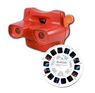
Now, you could look at the Grand Canyon, or New York City, or the Space Needle.. or what have you.  But they also had ViewMaster wheels of cartoon characters.  To make the 3-D effect work rather than taking pictures of drawings there would be pictures of models of the characters.  And something else.

This I imagine was one of the Seven Wonders of the World.  I mean, check out the detail!  Somebody worked their butt off making this set! 
First, the models by themselves were great.  They were very cleverly and skillfully crafted.  I loved those photos... the sets were so wonderful, the colors were just right... and I remember I had one where Huck stepped on a rake and it hit him in the face.  Emanating from his face were colorful stars...3D stars... made of light.  I still don't know how they did it.  But the combination of the physical models and the "light stars" was fascinating.  I loved that wheel... until my brother pulled all the little pictures out of it one day and destroyed it.
For instance, check out the Flintstones.

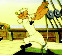
Somehow Yogi escaped from Jellystone and carjacked somebody's Austin Healy.  Sheesh.  Mike Angelo oughta set him straight.
Anyway, those 3D models added a dimension to my favorite cartoon characters that really impressed me.

I'm hearing myself drone on and on so let's move on to what will be Project Number Four.  Now, here's my theory.  We draw with shapes.  We use lines to define our shapes.  Thus, quality of line is important... but quality of shape is critically important if we want to communicate our ideas.

When I blue pencil a character I don't much care about the quality of the line.  I leave it rough and sketchy.  It's the shapes I'm after.  Once I feel I've captured the shapes, then I put a layer over that blue pencil rough and trace it with a high quality line.  I think this puts things in the right order: shape takes priority over lines.  But I only barely know what I talking about.  There's loads and loads of professional artists out there who'd probably say I'm fulla shaving cream... but I'll bet not too many cartoonists are among them.  You draw with shapes.

For Project Four I think we'll concentrate on some of the shapes used to create a character.  Communicating poses will be important.  For instance, running.  We can pose a character in a realistic running pose but quite frankly I don't find that terribly funny.*  I like the way HB cartoons would run: only their legs and feet would do the work.  Otherwise, they were straight up and down with their arms at their sides.  Now that's funny!

In fact, that will be the first set of poses for Project Four.  Characters that run.  Stay tuned.

*One technique that got used a lot by cartoon studios was rotoscoping.  You fix up a projector over a drawing table and statically project a film of some physical activity - frame by frame - and trace each frame onto a separate sheet of paper.  Then you modify the drawings to look like your character and when filmed it appears your character is doing the action.  This was especially useful for, say, complicated dancing routines where animating from scratch would be unacceptably complicated and time consuming. 

The problem with rotoscoping is it looked too real, too natural, to be very funny.  I never enjoyed it.

Project Three: final post to this project... for now!

Well, I'm going to go with this although I'm not very happy with the shading. 
Shading is something I'm still learning about.  There are, I guess, different theories about shading (as if I would know anything about it) but I notice when I copied this poster...
...(I would copy them so I could figure out how they did 'em) the technique appeared to be a "matte cut."  That is, you pull your arranged figures into Photoshop, set a mask, insert a black layer over your character layer and pull your mask up to it, and then "cut the mask" by painting over it and only permitting the black shadow to show where you want it.  Then you adjust the opacity of the black layer to suit your taste.

This is a very good technique for crisp, definitive shadows and it gives you a very clean composition.  The goofy soft brush technique I used in Project Three can give you a wild variance of results depending on a lot of things: how "artistic" you feel, the surrounding lighting, how tired your eyes are.  Generally I'm not satisfied with the result.  Not like the Scooby Doo picture above which was truly a pleasure to... ummm... copy.  Because that's what I did.

But ask yourself: would a matte cut make sense in the El Kabong picture?  I'm leaning toward no.  Too much of a good thing.

The nice thing about copying projects is you're pretty dang sure what the result will be.  The bad thing about copying projects is no client is going to want exact copies... that's what a Xerox machine is for... although you should expect to be told to arrange established characters into some sort of composition. 

All in all, copying projects is a good way to learn some techniques but a bad way to build a portfolio.  So please keep that in mind when I ask you to participate in these projects: they're learning experiences but hopefully we'll all move on beyond this point.  Something like that.

Anyway, we're the Academy of Cartoon Design, so for the next project I want to study a little cartoon design... as in how characters are designed.

Sunday, April 28, 2013

Project Three: characters colored in

Ahhh... it's so nice to have Sunday off so I can do what I've loved doing since I was a kid: draw and color.

Here we have the characters fitted to the background and colored in:
As yet there's no shading, no integration of these elements with the background.  That will happen this week.

Notice that El Kabong isn't purely white but an off-white.  The off-white will accept shading much better than a glaring white.  Also notice the dust trail EK raises with his reluctant feet.  A bit bright, perhaps, but I don't dislike it.  I used the SketchBook Pro soft airbrush for the dust effect.

With each of these characters I ink with the SBP marker brush which gives you nice thick-n-thin variation of line.  I preserve that inking layer, fill in the colors underneath, then I go back and duplicate the inking layer.  I "hide" the original layer, hit preserve transparency on the duplicate layer, and readjust the colors of the outline so they're closer to the fill colors and don't stand out quite so much.

By the way, I ordered Wacom's art brush for my Intuos4.  It showed up Friday and the damn thing is broken... what a disappointment.  The tablet will recognize the eraser end but the pen end doesn't register. Fortunately Amazon has a pretty good return policy and a replacement has already been ordered.  I was so upset ... especially after looking forward to using that art pen in this project for real variations of line... that I went ahead and ordered the airbrush pen as well.  Hell, I don't have any other vices but I do love digital drawing and painting so it's worth the additional moola.

Back to the project.  Now here's my typical problem: there's very little room left for lettering.  And I have a great idea about the lettering.  The title "El Kabong Strikes Again" will be "shaded" in the Mexican national colors red, white and green.  The El Kabong adventures do happen down in old Mexico, after all.  So the colors will be highly appropriate.

But now I've painted myself into a corner.  I can make the letters rather small and fit them across the top, very small and across the bottom... or do the inexcusable and keep the letters large and readable but cut off my characters.  Or I can extend either the top or bottom and place normal sized letters.

This is what happens when you don't plan.  I generally find myself in a jam and wondering what I'm going to do about it.  Remember the Wally Gator Little Golden Book cover?  I did the same damn thing!!

Ah well, stay tuned....

Saturday, April 27, 2013

Academy of Art Character and Creature Design Notes

I honestly had no idea there was such a blog.  Check out the model sheets: Academy of Art Character and Creature Design Notes.

In fact, check out the whole dang blog!!  Pretty informative!!

Thursday, April 25, 2013

Project Three: blue pencil characters

It's been a busy week but, anyway, here are the blue pencils.

Ladies first.  Here's the lovely senorita:
Love the tortoise-shell comb in her hair.  "Senor El Kabong," she's frantically calling.  "Your gee-tar!!"

And then El Toro, the mad bull:
He's emerging from the left so a portion of him is hidden by the doorway.  How economical!!  I can draw the front half of a bull all day!  Some of my friends say I'm all bull... but whatta they know!!?
Being pushed into the arena by Babalu is El Kabong:
"Now-a hold on there, Baba!!"
And taking it all in is the Terrible Tasbasco (note I've given the eyebrows an evil downward slant:
"Heh heh!  Ees a good day for the bull!"
Here I've populated our bullring "stage" with the blue pencil characters.  I've lightened the background a bit so you can see the transparent characters but once they've been painted in I'm bringing up the contrast:

I want to add a title, El Kabong Strikes Again, and at the same time I'm trying to lessen the annoying symmetry.  This is a challenge.  But have no fear.  I, El Kabong!!, shall prevail!


Sunday, April 21, 2013

Project Three: building a bullring

Now here is how a project gets away from you.  I meant only to blue pencil the outline of my bullring and then draw and fit my characters to it, but I got started on that bullring and before I knew it I was painting.

I tried very hard to stay true to the original Bob Gentle design.  Here it is for better or worse:
I maintained the color scheme and I even put those pastel clouds in the deep blue sky.  I pulled everything from SketchBook Pro into Photoshop and added some deep tones and contrast.

As you can see this will never make it as a comic book cover.  So... poster it is!

Remember, from the left the bull is emerging from that big square door.  Above him in the stands the lovely senorita tries to hand El Kabong his guitar.  From the right Babalu is pushing a reluctant El Kabong into the ring and above them, sitting in the stands, is the Terrible Tabasco enjoying the show.

Now to blue pencil the cast of characters and fit them on the stage.

P.S. What got me impatient about painting the background is that last night I visited SketchBook Pro's Facebook page.  There are so many incredibly talented people using that program... it's truly humbling.  I posted my Snagglepuss title card and actually got a few "likes."  Sympathy likes, more like it. 

Project Three: doin' the research thang!! ... including Patrick Owsley's sketches of QuickDraw.

As I'm sure you're aware, El Kabong is really QuickDraw McGraw.  Sorry if I deflated your belief in this "super hero."

Well, he is.  El Kabong is QuickDraw.  So to prepare for our poster/comic book cover/whatever project I looked for some model sheets.  I found some really good ones.

Patrick Owsley* is one of the greats and he posted some great pencil sketches of QuickDraw and Babalu.  Here's one that even includes the bull!
Ha ha!  Poor ol' "Queekstraw" doesn't know what's about to hit him!
This is Cartoon Network's standard model sheet of QuickDraw:
And here are some more of Patrick Owsley's sketches:
Well... he is a horse... kinda...

Coolness personified!!  QuickDraw with Snooper and Blabber and Augie Doggy and son.  Odd assemblage, I should say, but hey: great sketch!!
I think we all agree Mr. Owsley is a great cartoon artist!  If you check the "My Blog List" side-bar (to the right) you'll see I've included his very excellent blog.

What I love about his sketches is they are so true to the original show... they could easily have come from the original Hanna Barbera studio on Cahuenga Blvd. (3400 Cahuenga Blvd., in fact.  If you ever get the chance and you're near Burbank, stop by and pay homage to the "house that Huck built."  The buildings are still there, including the retro art facade, but now they're occupied by a LA Fitness and very expensive apartments - I'm sorry, but $1,850/mo for a 1 bedroom!!  Shame, really, but I believe the story is that when Turner Enterprises bought HB they relocated the studio onto the Warner's lot, something like that.  Don't quote me on that.)

Between these sketches, model sheets, and the video captures from the previous blog post there is more than enough info so that we can blue pencil our elements.

*Allow me to refer you to Mr. Owsley's Coroflot (an online design portfolio/info site).  This guy is fantastic and his site goes way, way beyond pencil sketches!! 

Friday, April 19, 2013

Project the Third: El Kabong Strikes Again

A while back I story-boarded a few scenes from El Kabong Strikes Again as an exercise.  You can see it here and decide for yourselves how successful I was.

I acknowledge that there isn't much value in storyboarding a completed cartoon except as an exercise.  And to gain an understanding of just how much work storyboarding is.  Trust me, it's a ton of work.  And I did things the easy way.  I'll never amount to anything as a storyboarder, that's for sure.

To all the professional storyboarders out there, hats off to you!!  

Anyway, let me pitch the premise for our third project: 

1)  It's either a poster or a comic book cover.  Right now I'm leaning toward poster because the visual lays out better in landscape rather than portrait.  But then... I'm not very good at these things.

2)  I envision Baba Loo pushing El Kabong into a bullring.  Here's the capture:
3)  At the opposite side of the bullring emerges this big, dangerous bull.  The capture:
4)  In the stands the lovely senorita (for whom El Kabong has entered the bull-fighting contest) tries handing him his guitar, or "El Kabonger!"
I plan on putting a guitar in her outstretched hand.
5)  And finally, the Terrible Tabasco sits in the stands enjoying the spectacle and the prospect of El Kabong being gored by the bull:
The capture actually has the Terrible Tabasco facing the other way but I want him behind and above El Kabong.  Conversely, I want the lovely senorita above the menacing bull and facing El Kabong.
That's the pitch.  A poster that tells a little story.  Once we've blue penciled all the main elements and fit it together we can worry about placing a title... if we consider that wise.

The bullring will be very simple.  We'll be at a grounds-eye view so, really, all we'll see is a concave wall and two door openings facing one another.  I love the soft, pastel clouds in the cartoon and I just know I'll try putting them in the poster (I'm a sucker for visuals).

Visualize: a door at either side.  From the left emerges the bull.  Above the bull, in the stands, the lovely senorita desperately offers El Kabong his guitar.  From the right Baba-loo pushes a reluctant El Kabong into the ring.  Above them, in the stands, the Terrible Tabasco laughs his evil laugh... delighted that this arch nemisis is about to meet a "gore-y" end.

Hey!  Not a bad lil' pun!

Wednesday, April 17, 2013

Side bar

I'm 60 years old and I grew up watching cartoons.  Still watch 'em, in fact, and I still love 'em.

Don't worry... I'm not going to bore you with why I love cartoons.  We all have our reasons.  And I'm no expert on the subject.  There are some very excellent blogs out there where you can read expert opinion on cartoons.  Yowp! comes to mind; you'll learn more from following that blog for a month than you'll ever learn from me.

I do want to recall for you what impressions I had from my very earliest days of cartoon-watching.  I was a fairly sensitive kid and I reacted strongly to visual clues.  The cartooning standards in the '50s of course included Popeye... always Popeye... and things like Mighty Mouse. 

Paul Terry's Mighty Mouse

Even back then I knew I didn't care much for Mighty Mouse.  I could never decipher his personality; I didn't like that cats were always being made the villains; I couldn't get any flavor out of those cartoons.  They were boring and dry and grey.  I can well believe that Paul Terry used to measure an in-betweener's output with a ruler: when the paper stack got to a certain point he'd tell him, "That's enough for today.  You can go home."

But back then there was also a show every kid watched.  That show was Captain Kangaroo.  And Bob Keeshaw had the power to make or break a cartoon studio by accepting their syndication.  Keeshaw never showed Hanna-Barbera... at least I don't think so... but he seemed to like UPA.  Especially when UPA took over Terrytoons.

They assigned artistic oversight to a young gentleman named Gene Deitch.  I've recently read some unkind things being said about Gene Deitch.  I don't think that's fair because the "look" that he gave to UPA/Terrytoons awoke something in me as I'm sure it did in countless other kids.

UPA's most successful creation Mr. Magoo at the left; Gerald McBoingBoing is in the middle; can't remember who the lady is.


Let's backtrack.  If you remember Famous Studios Popeye, you were familiar with this sort of look:

Famous Studios' Popeye...

UPA was completely different.  They hired true artists - in this writer's humble opinion, and certainly that's not to say Famous Studios didn't hire true artists - and gave a zany, modern, very simple, what today we would call a "retro" look to cartoons.  In that vein they were preeminent. 

Yes, I know they weren't the first first.  But it was UPA that brought that retro look to Captain Kangaroo and made believers of millions of kids.  It was our first exposure... first exposure?  I was 5 for gosh sake!... to what a cartoon could be!

UPA was probably the first to experiment with limited animation (what Iwao Takamoto refers to as planned animation which I think is a much better name!) to produce cartoons for T.V.  But I also used to see them as theatrical shorts.  One character was my favorite: a little artist wearing a smock and a beret called Gaston Le Crayon.  I thought he was hysterical.
Gaston Le Crayon, a supposed "French" artist, mincing over drawings of French policemen.  Oooo la la!!

It was on Captain Kangaroo that I used to watch Tom Terrific and Gerald McBoingBoing.  Tom Terrific was so limited a palette you could actually see through characters when they passed things.  It was literally pencil drawings on bond paper and little else.  And even though I was only 5, I could see the beauty and the cleverness in that.
Not shown: evil Crabby Appleton... rotten to the core!

Now, I said I didn't believe Captain Kangaroo accepted Hanna-Barbera syndicated output but I can't remember the exact circumstances under which I would watch Ruff 'n Ready.  It's funny that today I read how Ruff 'n Ready were HB's first venture in made-exclusively-for-T.V. cartoons ... this is all supposed to be ancient history... because I remember I used to watch Ruff 'n Ready religiously.  I absolutely loved them!
I loved Ruff 'n Ready.  They were always getting themselves into really interesting jams; things like being stowaways on a pirate ship; or being chased by this little guy with a Tommy gun who sailed around in a submarine; or going to Mars... stuff that a 5-year-old could really sink his teeth into!
 If you watched them you'd instantly recognize that early HB look.  [Note: in his book My Life with a Thousand Characters Iwao Takamoto took a dim view of references to a HB "look."  Consider that the Alex Toth/Doug Widley designed Johnny Quest ran concurrently with the Flintstones.  Any common ground there?  No, but by an HB look I'm referring to Ruff 'n Ready and '59 - '62 Huckleberry Hound, QuickDraw McGraw, Yogi Bear, and a host of others.  I don't wish to be argumentative but those cartoons did indeed have a look.]

I think the ultimate in cartoon design would have to be a cross between UPA creations and Ed Benedict designed HB characters.  That is my opinion. 

You may very well disagree.  There are so many new looks coming out these days.  Consider Pendleton Ward's Adventure Time. Or Butch Hartman's Fairly Odd Parents, Tuff Puppy.  Etc. etc.  So many different looks. 

Imagine a 5 year old who watches Cartoon Network.  Think of how he or she will wax nostalgic when they turn 60.  But, man, will they ever have things to be nostalgic about!!

I may have thought I grew up in the Golden Age of Cartoons but I think that day is today.  So flip the channel to CN or Nicktoons or Boomerang or what have you... it's all good.  We're in the true era of cartoons, my friends, enjoy it while it's here!

Monday, April 15, 2013

Project Two: last minute tweaks

I wanted to change a couple of minor details to our title card.  Here's the final FINAL version:
Let's give credit where credit is due... I added the Hanna-Barbera logo above our title.  And I moved the word "in" closer to the title.  It takes away some of that annoying symmetry and, I think, it reads so much better now... but maybe that's too much fussing. 

Also, I brightened the "Exit Stage Left" in Photoshop... it was a little too dim... and I darkened the word "in."  All in all this is now a pretty decent title card... if I do say so myself.

And by the way, I hate that tree on the left.  What was I thinking when I drew that foliage?  Anyway............. they're only supposed to be representations of trees.  A stylistic device, if you will.  But if I did this one over again I'd make that tree more believable.

So there's Project Two.  Now to dream up Project Three.

Sunday, April 14, 2013

Project Two (con't): colorful conclusion

The eyes play tricks on us.  Here Snagglepuss is actually a shade of orange but, because of the green background, we insist on seeing pink:


This I have to say is pretty colorful for a title card.  This would be better suited to the Fred Seibert era at Hanna-Barbera, maybe, than the original cartoons.

In any case my eyes are enjoying the color contrasts.

The "cloud letters" look as if they've been gently distorted by a breeze although I wonder if I look at this next week I'll think the same thing.  For one thing, they don't look as if they're off in the distance... they look as if they're directly over Snaggles.  What would a cloud-shifting breeze be doing so close to the ground?  Illogical... but it's a cartoon.  On the other hand their gentle curviness is a nice offset to an otherwise square-and-across composition.  I'm sticking with it.

As for hoping the title card will tell you something about the cartoon, let's see.  Snagglepuss for no apparent reason waits outdoors until near-sunset to suddenly launch into a run.  Gee... I wonder what the cartoon could be about?  Something about running...  something about sunset... hmmmmmmmmmmmmmm.

I give up.


Project Two (con't): setting up the background

It's been nearly a week since that last post.  Well, we all have to work for a living and like most of us I didn't have much time for artwork.  Bummer, because I really enjoy it.

Anyway, I got to thinking about my Snagglepuss Poster.  What type of poster should it be? I wondered.  And I thought and I thought.

And then it occurred to me: how about a title card?

A title card is a type of poster.  It introduces the cartoon and gives you just the slightest hint of what the cartoon is all about.  But you can't rely on the title card to convey a whole lot of information.  Logistically, one guy can be making title cards while the other guys are still making the cartoons.

For instance, right now on Yowp! is his review of the QuickDraw cartoon "Bullet Proof Galoot."  The title card shows QuickDraw running for his life while being shot at.  As it turns out, though, the cartoon is about QuickDraw competing with a mechanical sheriff for his job.

Could you have guessed that from the board?  I sure couldn't.  So that's good, in a way, because if you decide to make a title card/poster it can basically be anything... keeps yer options wide open.

So, anyway, back to my Snagglepuss title card/poster.  I didn't have any particular cartoon in mind.  So I made one up; I call it "Exit Stage Left."  Highly believable because that's something Snagglepuss says all the time.

I like that video capture with the Art Lozzi trees and background mountains and I didn't want to lose that vibe, so I based a very simple title board background on that:
Now all I have to do is load my pre-drawn Snagglepuss onto this background, color him in, and my board will be complete.

A couple things I notice about Hana-Barbera title cards:
  • They would stick with a very limited color palate... sometimes they would even be monochromatic.  We're talking about the cartoon, not showing off how artistically skilled we are (although if you ask me, those guys were extremely skillful in their creation of title boards).
  • They kept the design very, very simple.  Again, the focus is on the cartoon, not the title board.
My little creation might be a little too elaborate.  We'll see how it works with Snaggle-buddy out front and center.

Snagglepuss is pink.  My base color is green but I added an orange sunset behind the mountains.  If I make Snaggle lean more toward orange than pink this might work out.

Also, note the orange highlights to the cloud-letters.  Those "clouds" are a little too neatly arranged if you ask me, so I just might put a slight wave in them... maybe that will give the impression of clouds being gently pushed around by atmospheric breezes.  The problem is, I think, there are too many letters and so I can't seem to create a spirit of spontaneity.

I like the not-quite-symmetric long shadows from the tree trunks.  The trees themselves are the same simple design as from the video capture.

Onward.

Monday, April 8, 2013

Project Two (con't): drawing Snagglepuss

So I decided I wanted his head to face the same direction he was going to move.  That is, his "Exit stage left!" pretty much necessitates that he be looking to his left.

Here's the blue pencil:
That describes him pretty well, I think.

Here's the same drawing using SketchBook Pro's "steady stroke" feature:
I like the thick-n-thin with that particular brush, the # 2 brush.

Like several of the earlier Hanna-Barbera animal characters, Snagglepuss has "clam shell" ears.  For comparison, check out the model sheet for Pixie 'n Dixie:
.
Notice the ears aren't circular or oval but are that distinct clam shell shape.

Something else to notice about Snagglepuss is that his head slopes rather dramatically to his "hair points."  One nicely curved line from above his eyes to the side of his head.  His snout, although large, is logically balanced and never seems too "heavy" for him.  His jaw protrudes.

He has a pleasant tummy and soft teddy bear feet.  His tale forms an easy, lazy S.

I like everything about Snagglepuss.  I guess I should be saying, "Heavens to Mergatroyd!"


Sunday, April 7, 2013

Project Two: a little research

Animation studios would have model sheets so that animators could stay faithful to the look of the character and as much as possible draw "on model."

The most common model sheet - the one you see most often on the internet - for Snagglepuss is this one:
Pretty poor image quality (a xerox copy of several generations of xerox copies) but it conveys enough information, I think, to draw him.  Somebody posted the color reference version (an acetate cell, hand-painted cell laid over the basic model sheet; very important to the paint department so Snagglepuss doesn't appear one shade of pink in one scene and a different shade in another):

Actually, since there aren't any written paint references to this sheet I think it was probably done for fun.  And it does look like a helluva lotta fun!

Anyway... the study for the Tracy Lee maquette is a more dynamic Snagglepuss than the model sheets would indicate:
That's to be expected because the Tracy Lee studies are always more dynamic than the model sheets.  I love the way they bring out dimensions of the character you hadn't observed before... it's as if we're seeing Snagglepuss for the first time.  And let's face it, we like what we see!

As a matter of fact I might have shot myself in the foot... I don't think any poster I come up with will be as good.  Ah well, that's the risk I take...

Finally, somebody posted this video capture:
So all in all we have a lot of material to ensure we can do a decent job of drawing the character.

So let's draw him!

...By the way, what do you suppose happened to poor old Snaggle-buddy in this picture?
(c) Drake Brohdahl from the currently running The HB Show in Studio City (haven't seen it and I doubt if I'll get up there anytime soon)
On his blog Drake Brohdahl says he is a huge Hanna Barbera fan and was very proud to be invited to exhibit a piece for this show. 


Saturday, April 6, 2013

Project the Second: decisions... decisions...

I recently made 3 video captures that I find interesting and I thought I could use for future projects.

This time around I want to make a poster.  Unlike a Golden Books book cover, a poster doesn't have to introduce a story or feature a gag.  It only has to be representative of the character.  Keeping that in mind, here are the captures.


Here's the first capture:
First of all, notice the clarity.  Whoever posted this video to YouTube chose a really high resolution copy; the capture is frameable in its own right.

I love the Art Lozzi fall colors in the trees and the shading of the grass, as well as the faded purplish, rolling hills/mountains in the background.  This is a great representation of Snagglepuss in his famous, "Exit!  Stage left!" pose.

Here's the next capture:
Here we see Ricochet Rabbit and his sidekick.  Notice how Ricochet's pose is so similar to the Snagglepuss pose.  But there's no humor in Ricochet's expression.  He's off to serious business.  That could tell a story, yes.  But a poster?  I dunno... but I'm not ruling it out.

One thing that appeals to me is the desert backdrop.  All those saguaro cactus against a peach sky... very Hanna Barbera from the early '60s.  When I was a kid I'd watch these cartoons on a little black and white set and I couldn't appreciate the wonderful soft colors used for the backgrounds.  Shame because I'd have enjoyed them more.

Lastly, here's another high resolution capture:
Now, I thought with some modification this would make a good comic book cover.  The trick with comic book covers - as opposed to Golden Book covers, which serve to introduce the story - is there has to be some kind of gag. 

Here we have Barney, Fred, and their little buddy Kazoo (according to Iwao Takamoto, Kazoo is the only Flintstones character he designed; incidentally, I just finished reading the late Mr. Takamoto's book, My Life with a Thousand Characters; I highly recommend it!)

Unfortunately, nothing funny is happening here.  Fred's laughing... but why?  I thought maybe if Kazoo had a dinosaur egg wedged between his antenna... I dunno, that's not very funny.  Well, it's kinda funny.  But you see the thinking process: with a little work this could be made into a solid comic book cover.

 Actually, because it isn't a gag and it doesn't tell a story, and it is somewhat representative of the characters (Fred's a ham; Barney's worried; Kazoo is just plain pissed off) this is also good poster material. 

Hmmmm.... decisions, decisions.

You know, I think I'm going to go with choice number one, Snagglepuss, because the capture is so perfectly representative.  But I do intend to use numbers two and three in future projects.

So, let's begin.

Thursday, April 4, 2013

Project One: final FINAL conclusion

Lame!!  That's what I thought when I looked over last night's effort.  I had worked late and I was in a hurry - never a good frame of mind when drawing - and I slapped together something that looked pretty lame.

Here is the final final project:
The Photoshop water might seem like a cop out but it sits well.  Some wavering reflections and bits of color bring it to life... a bit.  The thing I really liked from the Hawley Pratt example was the bubbles in the water which I emulated and put around Wally's little island.

The foliage in front of the fence and meeting the water looks a bit better.  I used some SketchBook Pro brushes... I love 'em much better than Photoshop brushes but probably because I'm better at using them.  I also gave some texture to the galvanized steel fence posts; now they look slightly crusty which is how a chain link fence should look.  Especially one that's close to water.  Now it's a fence you could bang yer head on!

This one looks a little livelier and something I had forgotten: water should reflect the sky.  If they sky is hazy, your water is hazy.  If the sky is dark, dark water, etc.  But you can't have hazy sky and colorful water... it looks ridiculous and immediately your antenna goes up: something's wrong here.

For me, this one works and here is where I'll park it.  A year from I'll cringe when I see it but ... that'll be a year from now.  Right now I'll settle on this one as my final final project number one.

Wednesday, April 3, 2013

Project One: conclusion... or is it?

For purposes of this project I'm going to say, "It's done."  With the caveat ... or disclaimer... or what have you... that we may return to it.

Here's my "final" cut:

There's things I like about it... things I don't like.  But overall it gets the message across.

Lotta green in this one... just sayin'.

Now here's something I've kept "hidden" from anyone who is interested.  In fact, there was a Little Golden Book about Wally Gator and it wasn't drawn by some no-name in-betweener... it was drawn by none other than Hawley Pratt, my favorite Golden Book illustrator. 

I've never seen the content but here's the cover:

Personally, I find the cover a little confusing.  Exactly why is Wally's Zookeeper bringing Yogi Bear an ice cream sundae?  What is the relationship between Yogi and the Zookeeper?  Huh?  Huh?  Huh!!

And why is Wally so nonchalant about it?  Guess you have to read the story to find out.


Tuesday, April 2, 2013

Project One (con't): progress report

My time has been limited but I've kept working on the project.  Here it is so far:
The background is coming along nicely and the only thing we're missing is the water around Wally's little island.  Right now it looks like it's in the middle of a dry cement pool. I have some ideas about putting water in the pool, so to speak.  That will be tomorrow's project.

Those buildings in the distance are effective in communicating that Wally is in the middle of the city... but if Art Lozzi had done those building he'd be sure to put a water tower or two on them.  I dunno... they serve their purpose as is.  Too much detail on a distant background element could be distracting.  Lemme think about it...

The "City Zoo" sign works one moment and the next it looks too uneven.  I think it might be wise to rewrite the sign so "City Zoo" covers the length of the sign.

I like the foliage behind the fence.  That's actually a combination of shades of green and some SketchBook Pro "texture" brushes.

The chainlink fence itself is very simple and, to my eyes, effective.

The salmon lettering still seems to do a good job of offsetting a picture full of greys and greens.

To be continued.  Stay tuned.