Tuesday, April 29, 2014

Space Gal!

As I mentioned before, Shane Glines is the hands-down best for cartoon women.  His "space gal" design is a winner in my book.

When we start drawing, it's a good idea to emphasize her hour-glass shape:
The distance from ankle to waist is so much longer than waste to shoulders. 
Then we build up:
Start with your basic shapes.  Work on getting the angles and proportions just right.  Believe it or not, this one is a clean up copy of many squiggles. When beginning a drawing it's hard to get your proportions just right.
We add all our basic details including the shape of the hair and the suggestion of gloves and boots.  Gotta love gloves and boots on a Space Gal!
Add the final features
And viola! you have your basic Space Gal.
In Glines' picture she unfortunately is bouncing a beach-ball sized eyeball in her outstretched hand.  Hey, you find strange things in space!

Glines' drawing is a study in flowing, logical lines and beautifully rendered shapes and spaces.  There is so much to be learned from this character.  To start with, let's look at the overall proportions:
We can see where the emphasis is: from the bottom of the feet to the waist is longer than from the waist to the top of the head.  The upper torso and head are compact and, in Glines' example, beautifully proportioned.

You can only describe her shape as voluptuous.  The flaring of the hips and the emphasized breasts certainly tell us she's all woman.  Solid without an ounce of fat.  The tiny waist emphasizes that ... but take another look.  As much as the waist, the shoulders also say "solidly built."

Do you see how the shoulders can emphasize compactness and solidity and indicate voluptuousness just as much as the waist or the hips?!  That's a new one to me... and this is turning into a real learning experience.

This one is not hard to draw but very tough to draw well.  Practice it and have fun with it.

Saturday, April 26, 2014

Drawing with Shapes

The basic rule is: we draw with shapes.  If we're using a pencil, we use lines to define those shapes.  If we're drawing with paint, we can define the shapes with "blobs" of paint.  In either case, the shapes are the main things.  We begin our drawing by deciding on our shapes.

Cartoons are chock full of examples where a very clever person transforms a few basic shapes into an interesting drawing.  I looked around for a couple of cartoons based on very simple shapes... simple, and yet the final drawing was complex enough that it keeps our interest.

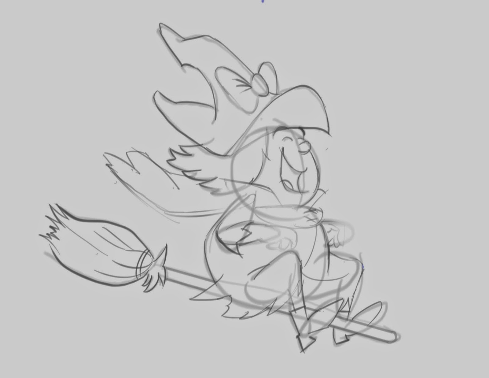
The first example is the Hanna Barbera character: Winsome Witch.  We start with 2 basic ovals:


I got a little ahead of myself here and started adding other details... but you can see the body oval and the head oval.  These 2 ovals comprise the basic character.  Then I started tacking on arms and legs, a hat, and put her on a broom (all based on a HB model sheet).

Now we fill some details:
Now it's starting to look more like WW.  Pretty happy gal, by the way.

Finally the clean-up:
And there's Winsome Witch... a character based on 2 ovals.

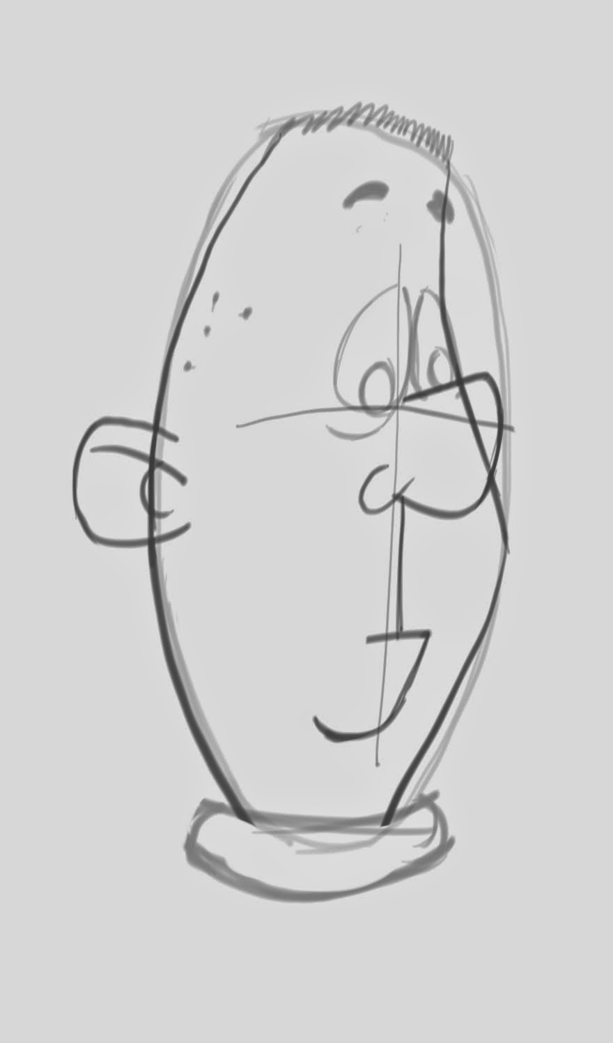
Here's another example of Winsome.  Here's the 2 ovals:
I started by defining the ovals and added the suggestion of arms, legs, and her hat.  And her nose!

Then I began building up the details:
And the final details:
I love this pose, by the way.  Incidentally, some of you might be asking: what became of the original blue pencil ovals?  Well, with digital programs it's easy to change the color of your pencil lines.  I start in blue pencil so it's easy to distinguish the details over the basic drawing.  Once it starts pulling together, though, I change the original blue to a more realistic graphite color.

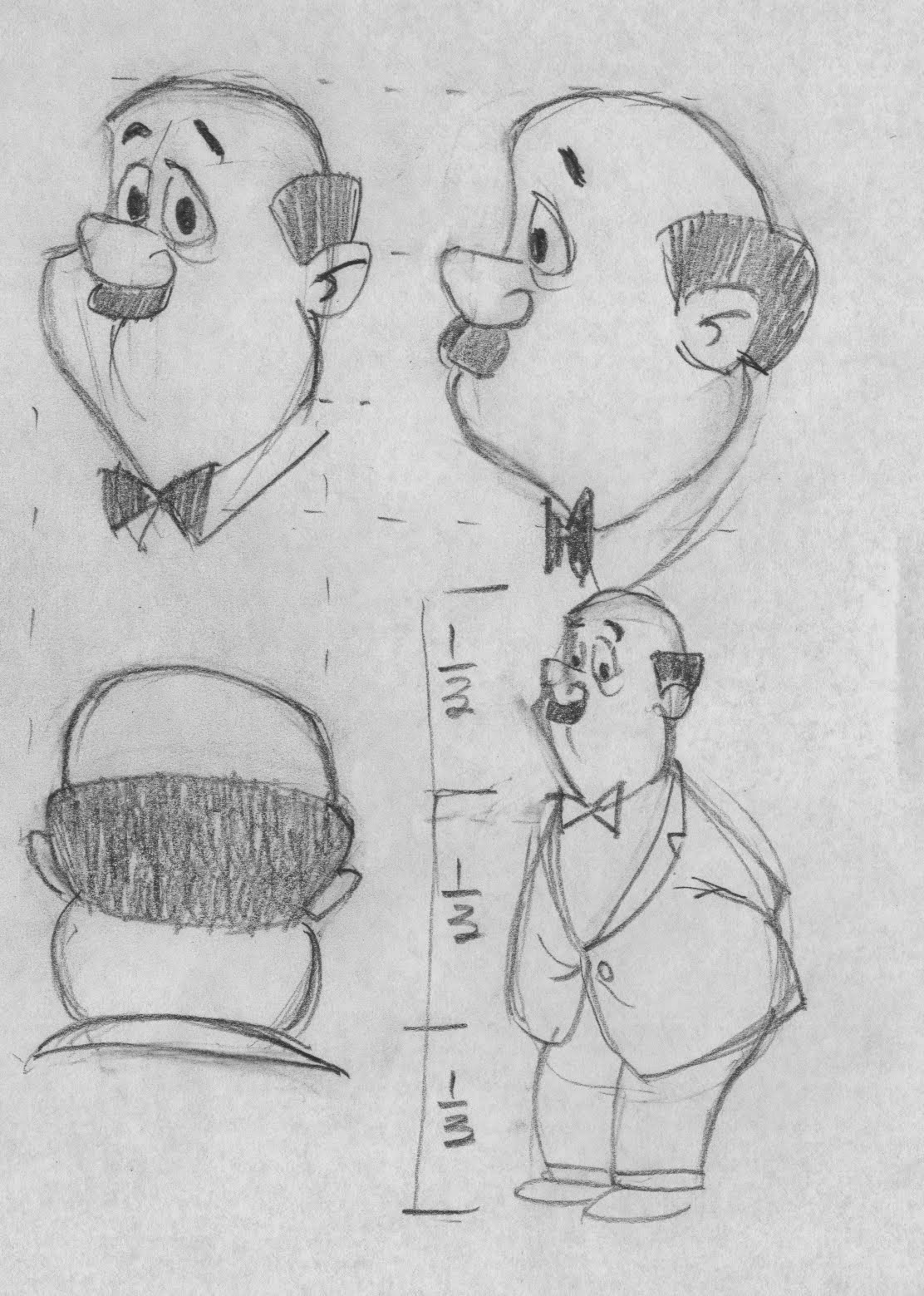
In my search for cartoons based on very simple shapes I came across Fred Seibert's site (of his many, many sites) extolling praises for Eric Robles' development of the Fan Boy and Chum Chum characters.

Robles truly is a character designer-extraordinaire.  His characters are based on extreme simplicity of shape... and yet they are full of life.  Here's an example of Boog (the guy with the Frosty Cup hat):

We start with what only can be described as a hot dog:
... kind of a fat hot dog at that.

Then we start defining the pose and a few of the details:

Next I started filling in the details... but notice that I "thinned out" the original drawing a bit, something that's easy to do digitally but would be a real pain in the rear with paper and pencil:
It's hard to get your proportions exact at the beginning.

Now we build up:
... and the final details:
So here I've presented 2 examples of robust, interesting cartoon characters based on very simple shapes.  I think there's a lesson here: if you are designing a character, keep the basic design very simple.  You can add complexity in the details but the basic structure should be easy to draw.

At least, that's the lesson I'm getting from this.


Friday, April 18, 2014

Rough sketch... very rough.

If you're looking for inspiration in drawing women... especially cartoon-style women... I can't think of a better artist to follow than Shane Glines.

http://cartoonretro.deviantart.com/
https://www.pinterest.com/ALNfoto/shane-glines/
http://www.pinupcartoongirls.com/2006/08/curves-art-of-shane-glines.html
http://brandstudiopress.myshopify.com/products/cartoon-retro-the-art-of-shane-glines

He's one of the best there is.

This morning I tried a rough sketch of one of his most innocuous drawings... warning, the "Glines gals" can get pretty risque... while trying to capture the proportions, the curves, the angles, etc.
I'm not after finished product here, just a hint of how it should lay out.

Let's notice a couple of things before venturing on in this wild, new, wacky world of drawing the fairer sex (sorry, got a little excited there):

Notice the angles, especially of the upper body to the lower.  This gal is so tall and thin and lithe and flexible... it's like trying to draw a piece of string.  String with curves, that is.

The head is big in proportion to the body... this is a cartoon after all... but not so enormous you can't stand it.

The legs are long!  Whoa!!  Those are some long legs!  H.G. Wells once remarked young girls are all legs and hair.  From the feet to the waist that probably takes up 2/3s of the figure.

Young people are flexible.  When self-conscious they twist themselves into tortuous postures with no apparent discomfort.  Old people stand upright and squat.  They can't afford to be self-conscious because standing too long hurts.

The eyes are huge.  She almost looks like an alien bug.  Young girl eyes are interesting and we'll examine that further.

Incidentally, I could never have drawn today's exercise intuitively... I don't have the chops.  Glines is the expert.

Wednesday, April 16, 2014

Drawing the Better Half: Women in Cartoons

There are loads of examples of how to draw cartoon women... YouTube is full of 'em.  All those tutorials are good and I encourage you to watch them.

As for me, I don't have a "structural strategy" for drawing cartoon women.  Not yet, anyway.

I started with perhaps the most iconic cartoon woman ever created: Tinkerbell from Peter Pan.  Here's the basic rough:
... and here's the clean-up:
I got this pose off the internet.  As I recall... and I do recall seeing Peter Pan when it was first in theatres... I might have been 6... the original Tinkerbell was perhaps more '50s oriented, although this particular pose isn't bad.

In the movie Tink had lots of character.  She got jealous because Peter Pan was directing so much attention to Wendy.  She'd get really p.o.'d and hide.  This particular Tinkerbell in our drawing seems a little too sweet for my recollection.

As you can see, my basic strategy is to keep eyeballing the drawing to gauge that it "looks right."  I also included the gossamer wings but that isn't especially useful to us right now.

Proportion-wise, I could see that our "quarters" rule isn't going to work.  Tink's proportions are more in line with reality... albeit the head is somewhat large... of roughly 4 and a half heads tall:

If we are going to examine an underlying structure, I suppose it would look like this:
... but I'm not much of a structure guy.

For me, Tink was a hard one to draw.  Try it, have some fun with it.

Saturday, April 12, 2014

Another Fletcher-style head

I really like Fletcher's character "The Friendly Fireman."  Goofy looking but with aerodynamic lines... a pleasure to draw.  Let's take it step by step.
1.  Start with an oval.

2.  Add the eyes/nose/ears guides.

3.  Shape the head using our oval as a reference.

4.  Add the facial features.
5.  Let's draw that big ol' fireman's hat!

6.  Finish roughing the final features.
See how it cleans up nicely?
For those of you using pencil and paper you might be wondering: how do you erase all the rough sketching for your clean-up?  In the paper and pencil days the animators would use a light box and place a clean sheet of paper over the rough drawing to pencil in the finished drawing. 

In fact, they might even hire a guy or gal to do cleanup... it was the cleaned up copies that were forwarded to the ink and paint department.  Otherwise it might be too confusing for the inkers to decipher which of the rough ovals, circles and construction lines to keep.

Digital cleanup is basically the same thing.  After creating your rough drawing you create a new layer and draw your final drawing.

Anyway I found this particular character to be a lot of fun to draw and I hope you enjoy drawing him as well.

Friday, April 11, 2014

The Jim Fletcher-style head

Here's the first example of how to draw a Jim Fletcher-style head.

First, we can draw an oval:
Nuthin' fancy....


 Then we add our face "eyes/nose" lines:

Now we draw in the head shape, emphasizing the indent and giving a nice curvature to the head:
We add our nose and mouth... I'm using Fletcher's example but you can choose any nose shape you like.  Short and stubby like this one, or long and thin.  It' up to you:
Now I rough in the eyes.  For me, eyes are hard.  I want to get the shape just right.  Fletcher as well as a lot of the HB artists bring the eyes to a slight point on top.
Finally we clean up our drawing:
And viola!, one funny head shape!

Notice that unlike the HB clean ups I referenced earlier, Jim Fletcher does allow the suggestion of a neck.  I like to think of his heads basically as balloons that inflate out of the shoulders.  As they get more inflated and the balloon stretches it creates these oddball shapes, slightly off-kilter, that I really like.

Tomorrow we'll try another of his head examples.  Until then.

Thursday, April 10, 2014

Another way of presenting a few characters

Whitman Publishing put out hard cover books similar to Little Golden Books which also incorporated Hanna-Barbera characters.  One of the artists they used was Jim Fletcher, other times referred to as James Fletcher.

I get a huge kick out of his generic men characters.  Here are some scans of where I noodled with Fletcher characters:
...even the dog looks funny!

Extrapolating on a generic Fletcher character.


Odds 'n ends Fletcher style.
... and here's a digital drawing of the "guy in a fedora":
They don't especially violate our heavyset human male character "rules" more than they are an interesting variation of them.  They aren't made up of perfect fourths... these are very rough fourths, leaving the cartoonists a lot more discretion.  The legs tend to bend at the knee.  The feet face forward rather than appear splayed directly apart.  These body postures are less assertive than our earlier HB examples but they're still pretty dang funny-looking.

Compare the pictures above with this composite of our 4 earlier HB examples:


I really like the Fletcher head shapes and that will be the subject of our next post.  Stay tuned.

Wednesday, April 2, 2014

HB Design: Heavyset Male Human Character # 4

As a 4th example of the HB heavyset male, human character here's Mr. Cogswell from The Jetsons:
Doesn't look terribly happy.  Here's Mr. Cogswell with our height proportions:
I might have drawn the legs just a tad too short but, overall, Mr. Cogswell is consistent with our "quarters" theory.

So in creating a HB style heavyset male, human character, we want to be mindful of the following:

  • The body is comprised of fourths: the head encompass a fourth, the legs and feet encompass a fourth, the torso comprises 2 fourths.
  • No visible neck.  The head "emerges" from the body.
  • The torso is basically an oval.  Nuthin' fancy.
  • The head indents at the nose, resulting in the lower half being larger in circumference than the upper half.
Here's a couple of other observations... and in the interest of time I'm not going to draw every example.

Feet

While simply standing, the character often has the feet spread apart...
... as with Mr. Spacely here (drawing courtesy of Hanna Barbera)... or at an inverted "V" angle:
Check out the front view of Fred and Barney; notice the "v" angle of the feet.
... as with Fred and Barney (drawings courtesy of Hanna Barbera).  Also, I notice that full on frontal poses were less popular among the character designers at HB than three quarter poses.  With good reason, I think, as three quarter poses are more interesting.

Hands

Simplicity in the hands often masks complex design choices (as a friend observed).  I suppose it depends on the situation but many HB characters sport arms ending in "finger clusters"... kinda spooky when you think about it but very funny when they were rendered by the good folks at HB.

I was noodling around with hands I observed on different HB characters.  Note: not all the characters above are human.
Personally, hands can be hard for me to draw.  I find I have to do them slowly but even then, it's hard for me not to make the fingers too fat.

These hands belong to Mr. Jinx, the cat.  But they're good generic hands nonetheless.
So I think we have enough material to create our own heavyset male, human character.  Whatdya think?