Sunday, March 31, 2013

Project One (con't): Putting finished elements to our book cover


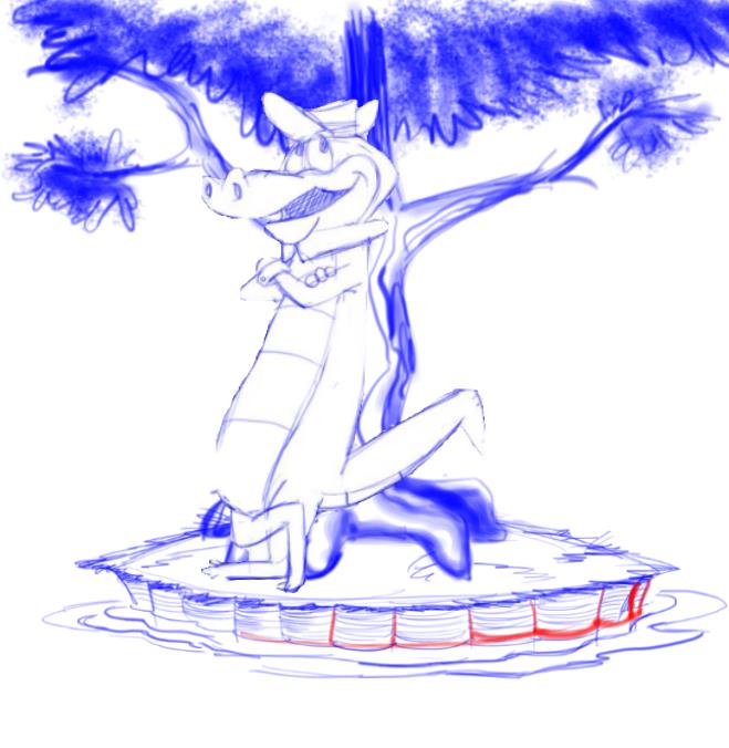
Here we can see that our book cover is starting to come together:


We still have some background elements to add but the basic cover has shaped up and is starting to make sense.

I promised to teach you (those of you less familiar with digital art) a neat trick with lettering.  I originally intended to leave the lettering white but I found that Halloween-candy orange to be more than appealing.  Notice how the orange "Wally Gator" is backdropped or, most correctly, drop shadowed in white.

What we do is we put our different lettering on separate layers.  I have separate layers for "Wally Gator," "Hanna Barbera's," "Little Golden Book," and the lines bordering the words Little Golden Book.

1.  I went to my white Wally Gator lettering layer and duplicated it.  Now I have two white Wally Gator lettering layers.

2.  I then set the topmost one (the new duplicated layer) it to preserve transparency (remember, I told you this is an extremely useful tool.)

3.  I then ran a paintbrush over it making it - and only it, nothing else was affected - that pleasant orange... salmon, really.

4.  I then went to the underlying lettering layer which is still white and shifted it a bit.  To really fine tune the repositioning you can use your arrow keys.

5.  The placement of the upper salmon letters over the lower white letters gives it a very professional, finished look.  And consider this, I forgot to clean up these letters.  Still, they look good.  At least I think so.

I placed a solid-color layer under all other elements and made it a hazy, autumn-like blue.  I then placed a layer over that blue and used a black-to-transparent gradient and tamped down the opacity.  The resulting picture is a little dark but we can adjust that later by increasing the brightness.

I like the color combo but let's keep this in mind: a Fall sky over an island sprouting daisies, which means Spring.  It can be Spring... or it can be Fall... but it can't be both.  Well, in cartoon-ville it can.

Project One (con't): taking a step backward

Remember what I said about allowing the project to take you by the nose and lead you around?  Well, the more I looked at my "finished" elements, the more I didn't feel it suited the subject matter.  Wally looked too much like a chalk drawing.

So I took a step backward, I redrew Wally - this time in SketchBook Pro using a brush in conjunction with the "steady stroke" tool - and put our new Wally on the island.  Then I imported into Photoshop (remember, we save all our files as Photoshop files) and by using masks, gradients, and a soft brush, I put a more outlined but still softened (somewhat) Wally back on the island:

He still has some soft shading but this Wally stands out more and, I think, more suits the subject matter.  You may disagree...

Anyway, this is the one I'll go forward with.

A couple of things to keep in mind...

1.  My troubles with the last Wally began when I realized -and this isn't the first time this has happened - that I'd created too small a file.  When a file is that small there is more "pixelation" (lines look jagged and rough) in the outline and it becomes harder to apply the Photoshop gradients... truly wonderful gradients.  You don't want to place yourself outside that capability.  Luckily, by simply resizing the image and beefing up the resolution (to 200 pixels/inch) I was once again able to use the Photoshop effects.

Incidentally, I prefer Photoshop gradients to Corel Painter gradients, which I find annoying and unnecessarily complicated.  SketchBook Pro doesn't yet feature gradients but if we collectively keep up the pressure they'll eventually include them.  SBP is a wonderful program and it keeps getting better with every new version.

If you study Wally you'll see he is subtly darker at the top then at his feet.  This is the application of a PS "black to transparent" gradient through a mask created by outlining Wally; I turned the opacity way down on this effect so the effect is very subtle indeed.  I then used a very soft PS brush on another layer to add shadowing.  I used other layers to add shadow to the island and the tree.

By the way, full blown Photoshop is an expensive program.  Fortunately, much of what we digital artists need comes with Photoshop Elements.  It doesn't break the bank and it is extremely useful.  Incidentally, if you buy a Wacom Intuos graphics tablet (highly recommended) they generally include Photoshop Elements as part of the software package.

2.  Although I am practicing my stand-alone drawings, if you're like me you have a rough time avoiding meandering lines and spaces that don't make sense.  Stand alone Wally in the drawing above has -to my mind - some glaring flaws.  But notice how that doesn't seem to matter much in conjunction with other elements of the composition. 

Now, this isn't a good practice to rely on the busy-ness of your composition to mask shortcomings of the individual elements.  The genius cartoonists out there don't have that problem; everything they draw is perfect.  Well, nothing I draw is perfect... not even close.

Since I can't rely on perfection in my elements, I at least try to excel in getting them to play well together.

Next we'll frame our elements in our book cover and see how if it works.  Then we'll add our background elements.  We're halfway there, folks.  Keep on drawin'!!

Saturday, March 30, 2013

Project One (con't): populating the island with 1 alligator


He I've added Wally Gator and guess what?  He looks entirely out of place on our little island.  Not because an alligator doesn't belong here but because he looks so "acetate cell" -like... it doesn't fit with our background.

One trick with your character is to keep your outline and your colors on separate layers.  Now you can go back and do a preserve transparency on your outline layer and recolor it to more closely match your underlying colors.

"Preserve transparency" is a command in most drawing/painting software that basically says: you can only change drawn lines and colors but leave the transparent areas alone.  Meaning you can now swipe a paint brush over outline layer and the only thing that changes are the lines themselves.  Thus, you can always go back and change the colors of your lines or, for that matter, any colored area.

It's a great tool that you'll put to use many many many many many many... puff puff pant pant... many many many many times in your digital art career.

Here's our scene with the color of Wally's outline changed:

See how already Wally is starting to "blend in?"  Well, he's an alligator, not a chameleon.  So we still have to work him somewhat.

Now remember, he's under a tree.  A tree casts shade.  So we can shade him to blend him into the scene.  Although I keep my file as a Photoshop file, remember what I said before: Photoshop is the "common currency" of art software.  I brought that file into Corel Painter and used one of their nicest shading tools that they call "soft charcoal."  It handles pretty well and is controllable.  Maybe I got a little carried away, but here's my impression of a 3-D Wally under his tree on his little island:

Now Wally is looking like he belongs there... much as he's thinking of getting out seeing the world.

Major bummer is that Wally is standing on a couple of daisies.  Daisies sprouting up from the grass means it's Spring.  Wally Gators start thinking of lady gators in the Spring.  Do you blame him for wondering if there's more to life than just hanging out at the zoo?


Friday, March 29, 2013

Project One (con't): island and tree rendered in color

There's still a few things I need to tweak but here's the island and tree using a few brushes in SketchBook Pro.  I added some daisies for color and to add a little excitement (pickin's are pretty slim when daisies add excitement, don't you think?)

This may or may not be the way the final tree looks.  It's important not to let the project grab you by the nose and lead you around because invariably you don't like the result.

I think I'm going to add foliage to the top... in fact, it'll become a solid forest green back lighting our lettering, which will probably be white.  This is one example of how the project got away from me; I didn't make the foliage tall enough to suit the book cover and now I'm going to have to work around that.

Bummer.  But now to color in and add Wally.  Stay tuned.

Thursday, March 28, 2013

Project One (con't): drawing Wally

As I mentioned, I enjoy drawing in SketchBook Pro more so than Photoshop or Corel Painter.  My preference is based on ease of interface and not having to make a dramatic production out of every re-sizing, erasure, realignment, etc.

That said, SBP is limited in comparison to Photoshop or Painter insofar as transforming an image or in the sheer volume of brushes... digital applications of color and texture... and effects.

It's an acceptable trade-off if your objective is to produce a lot of drawings in a hurry. 

A note on file formats.  SBP saves in TIFF files; Corel Painter saves in a proprietary format; ArtRage - another interesting art software - saves in its own format.  And none of these play well with the other softwares... except that all of them save in, recognize, and export Photoshop files.

Photoshop, you see, is the "common currency" of art software or at least it is so far as I am aware.

When "inking" Wally (giving him a finished look) I started in SketchBook Pro.  I especially like SBP's Steady Stroke feature.  In conjunction with a thick/thin brush or their good ol' # 4 pencil, Steady Stroke offers a really professional look.

But I'm also interested in some of the brushes available in ArtRage.  They have an ink pen call "thick/thin" that handles pretty well.  That's the one I finally used for this rendering of Wally (notice I changed the front brim of his fedora):

I like the thick boldness of the line and the way Wally is spelled out pretty non-ambiguously.  I mean, could Wally ever be ambiguous?  Well, I suppose he could if you drew him with a thin, never varying line.  The thick/thin line on the other hand makes him stand out a bit from the page.

I tried it several different ways but I think I'll use this one.  Now, that raises a question a few of you may have: are we going to use a heavily lined Wally on our Golden Book cover?  Is that the "traditional look" they strive for?

The answer, of course, is "no."  But not to worry.  I'm even going to color Wally in with flat, unvarying colors which, in conjunction with those heavy black outlines, will look very much like a hand-drawn cartoon.  But that won't be the final product.  Oh no, trust me on this.  We're going to start out as colors behind a black-lined figure... but that will change with the introduction of Photoshop.

I like starting simple and then building up from there.  And I don't build much.  I like things to stay pretty simple.  Stay tuned.


Sunday, March 24, 2013

Project One (con't): framing our elements

I had to work this weekend... but I had a chance today to do some more to our project.  I had a brainstorm and imported a photo of a Golden Book into Photoshop.  I "whited out" the detail but kept the silverly spine cover.

When we frame our elements in this Golden Book photo, we get something like this:

A little sketchy, I admit, but it'll look better as we go along.

Also, I added some lettering which is consistent with the show opener.  I'll clean it up as the project progresses.  Also, later I'll show you - at least, those of you not too familiar with digital drawing - a trick with back-shadowing letters that looks pretty cool.

[BTW - I'm quite aware Wally's tummy is missing.  That stuff happens sometimes.]

Don't worry... as sketchy as it looks right now this project is going to come out fine.

Now to start coloring our elements.

Thursday, March 21, 2013

Project One (con't): adding a background to our design

The video capture features a straight background where the fence cuts horizontally across the picture, the hedges create a backdrop against the fence, and the city buildings are vertical, straight up and down.

That's fine for a cartoon but for our Golden Book page... or cover... or inside cover... I want to put Wally dead center and build the scene around him.  I figure something like this will do the trick:
Notice that our perspective of the fence has changed; it now curves a bit around the little pond.  The hedges still form a backdrop and the city buildings are still up and down.  I've also plugged in a "City Zoo" sign to sort of beat the storyline to death: Wally's stuck on a little island in a little pond in the city zoo.  No place for an adventurous alligator.

See how the picture already seems to suggest a story?  What's Wally thinking about?  Bet it's not how satisfied he is staying on his little island.  Is that itty-bitty chain-link fence supposed to stop him from exploring?  Well... would it stop you?

I'm using different colors to isolate the elements: foreground and background.  The sign was slapped together but the final product won't be edged by thick lines like that.  In fact, the sign and the background will be "drawn with paint," no boundary lines.  The lettering is effective but maybe it'd be better to hand-draw the letters.  What do you think?

Well, we've got a pretty good design here.  Now to make it into a painting!  Stay tuned.


Wednesday, March 20, 2013

Project One (con't): compositing our initial elements

Now that we have drawn our gator, island and tree it's time to put them together to form the initial composition.  Backgrounds will be added as we decide we like the direction things are going thus far.

Here's how I put our first three elements together...

There's a couple of things going on here.  First, my original little island was a little too robust and mound-like so I flattened it.  You might be asking (especially if you aren't that familiar with digital drawing), "How do you 'flatten' a drawing?"

SketchBook Pro has a pretty good tool for transforming drawn objects but it's limited to 4 directions: fatter, slimmer, taller, shorter.  I flattened and widened the island a bit to get the proportions right.

[The cat's pajamas for transformation tools is Photoshop.  Lawd almighty... there ain't nuthin' you cain't do with that program.]

I had to make Wally the right size in relation to the island and tree and, although I can't center him exactly, I did move him more to the center so that he's the focal point of our composition.  The tree looks small by comparison, certainly a lot smaller than the one in our video capture...but a Golden Book is a whole different look than a cartoon.  For Golden Books you have to maintain a pretty obvious center of interest.

Also, I red-lined the water edge of the island a bit as a reference to keep it more symmetrical in relation to the water and the tree.

I have some ideas about the background; it'll look a little different than the video capture.  That will be tomorrow night's project.

Until then...

Tuesday, March 19, 2013

Project One (con't): blue pencil Island and Tree

Wally's little island is interesting.  Here I sketched quickly and sloppily... do we really need perfection?  I added some gentle, wavy lines around the little island to suggest placid water lapping gently around its edges.  I added jagged little expression lines on the top of the island to suggest grass.

I used 2 or 3 different brushes in SketchBook Pro to suggest a solid tree with Art Lozzi type foliage.  I love the bark lines in cartoon trees... they're so expressive but also comical.  Imagine if the bark had no lines as if it was perfectly smooth.  Would that make for an interesting tree?  Not on my little island, nosirree.

Here is where digital art leaves the paper variety behind.  I superimposed the image of the tree on our little island and... viola!... we have Wally's Island.  Cute little place; nice and cozy.  But Wally must find it terribly constraining after a while.  Poor guy.
For the most part I use the pencil that comes standard with SBP.  No variation of line; very sketchy.  But this suits my purposes in striking out and creating the shapes that will become our Golden Book example.

Here's my thought: you draw with shapes.  Think about that.  You don't draw with expression lines or sketch lines or lines of any sort.  What you convey are shapes.  That's why you and I will never draw exactly alike... our shapes will vary, not matter how hard we try to remain the same.

That's not a bad thing; it's a good thing, really.  How we convey our shapes reveals our style.  Our style.  Everyone draws shapes a little differently. 

Monday, March 18, 2013

Project One (con't): Wally Gator blue pencil rough

I'm usually a pretty good draftsman but as you can see I didn't exactly copy the Wally Gator character from our screen capture:

For one thing, I'm not as interested in copying characters as I am in understanding what makes them tick.  Wally, like most Ed Benedict-designed animal characters, has a very long torso, short stubby little legs, long feet, in Wally's case short arms (ever seen an alligator with long arms?), and an over-sized head.  Funny, but also very hip in a 1950s retro sort of way.  If you removed the fedora and gave him a beret, Wally could be a beatnik gator.  Especially with a little goatee and side 'staches.  Most cool.


This blue pencil rough will serve our purposes because it conveys the essence of Wally Gator without slavishly adhering to the cartoon still version. 

Incidentally, I'm using SketchBook Pro Ver. 6 for my blue pencil drawings.  In fact, I enjoy drawing in SBP more than I do in Corel Painter or Photoshop.  SBP has everything you need for quick, spontaneous compositions and I highly recommend it.

Next we'll do a blue pencil rough of the little island and that very interesting tree.


Project the first: Golden Books gig

Now imagine this: you are a working guy at Hanna Barbera back in the '60s.  The rep from West Publishing is in the office with Joe and Bill... or as you address them, Mr. Barbera and Mr. Hanna... and they come out talking and laughing.  Joe happens to see you working assiduously at your drawing table and says, "Hey, c'mere a minute.  We've got a proposition for you."

It turns out the usual cast of characters... Hawley Pratt, Mel Crawford, Al White... you know, the guys... are all busy.  The idea is to put out a Golden Book based on Wally Gator.  He's a minor character and as the pros are busy, Joe figures a second tier in-betweener can handle the gig.

Overworked though you may feel, this is your big moment... your opportunity to show how you can shine... don't blow it, my friend.  The West Publishing rep, a little uncomfortable at working with an unknown (awww, don't be sensitive; let's face it, we're the unknowns) asks for an example of how you'd illustrate the little book.  So you dig in the back room and come up with a few scene captures.  Such as this one:


[Note: this is a perfectly awful video capture I got off YouTube... still, it conveys the basic information.]

I happen to like this scene because of the way Wally is slouching and has his arms crossed... unlike the more typical HB pose where the arms hang at the sides.  This particular capture shows a little-known side to Wally's character: he gets bored, he gets frustrated, he looks for a little stimulation in life.

So, anyway, here is the shot you're going to doll up and make into a picture that'll impress the rep from West Pub.  Now remember, Golden Books likes some depth of field.  That means - unlike your typical animation cell - shading, variation of colors, shadows.  And some highlights; maybe bright little flowers in the grass of Wally's little island; maybe the leaves are turning fall colors.  These are the sort of touches that tend to pull the character out of the page and into a little bit of reality.  I know whereof I speak: I used to stare at those Golden Book characters for hours when I was a kid.

We've got a pretty good starting point with our video capture.  Now to build on it.

-To be con't -

Sunday, March 17, 2013