Wednesday, May 1, 2013

Classic Poses: running

Since I don't know a whole lot about it I'm not sure how to present it.  So I'll just present things the way I do them.

When characters run - as I said - you can pose them realistically or you can pose them "cartoon-ily."  I happen to prefer the cartoon option because it looks funny.  Realistic poses, irrespective of the amount of skill required - and that requires some real skill - don't look especially funny.

Now H-B used to make their funny characters run straight up and down, arms hanging at their sides.  To me, the effect was hilarious.  This is from a Top Cat model sheet:
Top Cat running for his life... but notice he doesn't lean into the run.  He runs straight up and down.
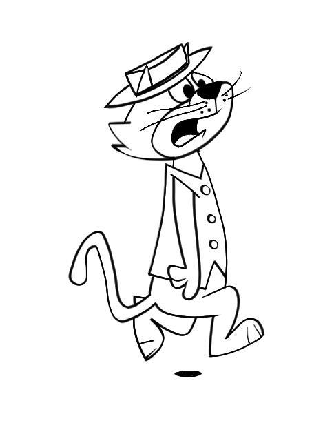
Now, to me, that's a funny pose!  So let's try it.  Here's my first blue pencil:
Pretty basic.  And I'm sure all of you can do a better job.  Then I start refining that blue pencil and making sure I've got the proportions right:
Now it looks like something I can ink reasonably well.  So I do that, trying for some variation in the line:
For the inking layer I worked in SketchBook Pro using the basic felt marker and the steady stroke function to smooth out the lines.  I used a Wacom art pen but SBP isn't as responsive to the capabilities of that pen as is Photoshop.  I just didn't feel like hassling with Photoshop.  As I said, SBP is quick and easy and the brushes are great... but there are limitations.

So there's Top Cat out for a run.  He's not jogging, that's for sure.  He's upset about something and anxious.  But he runs straight up and down.  Whatta geek!  Now that's funny!  Look at the little black spot underneath him: the suggestion of a shadow.  Meaning he's airborne for #$%^& sake and he's still running straight up and down.  C'mon, Top, lean into it!!

Next sesh we're still into running, but I found a poster that puts a little variation into TC's pose.  Equally as unlikely and equally as funny.  Stay tuned.

Monday, April 29, 2013

Sidebar: some (probably idiotic) ideas on drawing cartoons.

Obviously I like Hanna Barbera characters.  You might find that tedious... but I've loved these guys for over 50 years.  And I ain't about to stop lovin' 'em now!!

My posters wind up taking a semi-realistic look... that's assuming, of course, you think they look like anything at all.  One reason is I get such a kick from using the Photoshop effects... but that's a pretty lame reason for drawing and painting a certain way.  It should be something deeper than that. 

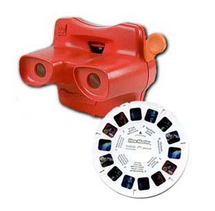
Well, let's see.  I think I like the semi-realistic look to my posters because I remember those old ViewMaster wheels.  For those of you who don't know what a ViewMaster is or was (they still make 'em, by the way) it's a device where you look in through the viewer ... resembling sort of a pair of binoculars... and look at something resembling tiny splices of acetate film - like movie film - set to opposite sides of a cardboard circle.  As you worked the lever on the side of the ViewMaster it would shift the circle to a different set of film/pictures.  The effect was 3-D and it was and still is marvelous.

Now, you could look at the Grand Canyon, or New York City, or the Space Needle.. or what have you.  But they also had ViewMaster wheels of cartoon characters.  To make the 3-D effect work rather than taking pictures of drawings there would be pictures of models of the characters.  And something else.

This I imagine was one of the Seven Wonders of the World.  I mean, check out the detail!  Somebody worked their butt off making this set! 
First, the models by themselves were great.  They were very cleverly and skillfully crafted.  I loved those photos... the sets were so wonderful, the colors were just right... and I remember I had one where Huck stepped on a rake and it hit him in the face.  Emanating from his face were colorful stars...3D stars... made of light.  I still don't know how they did it.  But the combination of the physical models and the "light stars" was fascinating.  I loved that wheel... until my brother pulled all the little pictures out of it one day and destroyed it.
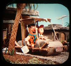
For instance, check out the Flintstones.

Somehow Yogi escaped from Jellystone and carjacked somebody's Austin Healy.  Sheesh.  Mike Angelo oughta set him straight.
Anyway, those 3D models added a dimension to my favorite cartoon characters that really impressed me.

I'm hearing myself drone on and on so let's move on to what will be Project Number Four.  Now, here's my theory.  We draw with shapes.  We use lines to define our shapes.  Thus, quality of line is important... but quality of shape is critically important if we want to communicate our ideas.

When I blue pencil a character I don't much care about the quality of the line.  I leave it rough and sketchy.  It's the shapes I'm after.  Once I feel I've captured the shapes, then I put a layer over that blue pencil rough and trace it with a high quality line.  I think this puts things in the right order: shape takes priority over lines.  But I only barely know what I talking about.  There's loads and loads of professional artists out there who'd probably say I'm fulla shaving cream... but I'll bet not too many cartoonists are among them.  You draw with shapes.

For Project Four I think we'll concentrate on some of the shapes used to create a character.  Communicating poses will be important.  For instance, running.  We can pose a character in a realistic running pose but quite frankly I don't find that terribly funny.*  I like the way HB cartoons would run: only their legs and feet would do the work.  Otherwise, they were straight up and down with their arms at their sides.  Now that's funny!

In fact, that will be the first set of poses for Project Four.  Characters that run.  Stay tuned.

*One technique that got used a lot by cartoon studios was rotoscoping.  You fix up a projector over a drawing table and statically project a film of some physical activity - frame by frame - and trace each frame onto a separate sheet of paper.  Then you modify the drawings to look like your character and when filmed it appears your character is doing the action.  This was especially useful for, say, complicated dancing routines where animating from scratch would be unacceptably complicated and time consuming. 

The problem with rotoscoping is it looked too real, too natural, to be very funny.  I never enjoyed it.

Project Three: final post to this project... for now!

Well, I'm going to go with this although I'm not very happy with the shading. 
Shading is something I'm still learning about.  There are, I guess, different theories about shading (as if I would know anything about it) but I notice when I copied this poster...
...(I would copy them so I could figure out how they did 'em) the technique appeared to be a "matte cut."  That is, you pull your arranged figures into Photoshop, set a mask, insert a black layer over your character layer and pull your mask up to it, and then "cut the mask" by painting over it and only permitting the black shadow to show where you want it.  Then you adjust the opacity of the black layer to suit your taste.

This is a very good technique for crisp, definitive shadows and it gives you a very clean composition.  The goofy soft brush technique I used in Project Three can give you a wild variance of results depending on a lot of things: how "artistic" you feel, the surrounding lighting, how tired your eyes are.  Generally I'm not satisfied with the result.  Not like the Scooby Doo picture above which was truly a pleasure to... ummm... copy.  Because that's what I did.

But ask yourself: would a matte cut make sense in the El Kabong picture?  I'm leaning toward no.  Too much of a good thing.

The nice thing about copying projects is you're pretty dang sure what the result will be.  The bad thing about copying projects is no client is going to want exact copies... that's what a Xerox machine is for... although you should expect to be told to arrange established characters into some sort of composition. 

All in all, copying projects is a good way to learn some techniques but a bad way to build a portfolio.  So please keep that in mind when I ask you to participate in these projects: they're learning experiences but hopefully we'll all move on beyond this point.  Something like that.

Anyway, we're the Academy of Cartoon Design, so for the next project I want to study a little cartoon design... as in how characters are designed.

Sunday, April 28, 2013

Project Three: characters colored in

Ahhh... it's so nice to have Sunday off so I can do what I've loved doing since I was a kid: draw and color.

Here we have the characters fitted to the background and colored in:
As yet there's no shading, no integration of these elements with the background.  That will happen this week.

Notice that El Kabong isn't purely white but an off-white.  The off-white will accept shading much better than a glaring white.  Also notice the dust trail EK raises with his reluctant feet.  A bit bright, perhaps, but I don't dislike it.  I used the SketchBook Pro soft airbrush for the dust effect.

With each of these characters I ink with the SBP marker brush which gives you nice thick-n-thin variation of line.  I preserve that inking layer, fill in the colors underneath, then I go back and duplicate the inking layer.  I "hide" the original layer, hit preserve transparency on the duplicate layer, and readjust the colors of the outline so they're closer to the fill colors and don't stand out quite so much.

By the way, I ordered Wacom's art brush for my Intuos4.  It showed up Friday and the damn thing is broken... what a disappointment.  The tablet will recognize the eraser end but the pen end doesn't register. Fortunately Amazon has a pretty good return policy and a replacement has already been ordered.  I was so upset ... especially after looking forward to using that art pen in this project for real variations of line... that I went ahead and ordered the airbrush pen as well.  Hell, I don't have any other vices but I do love digital drawing and painting so it's worth the additional moola.

Back to the project.  Now here's my typical problem: there's very little room left for lettering.  And I have a great idea about the lettering.  The title "El Kabong Strikes Again" will be "shaded" in the Mexican national colors red, white and green.  The El Kabong adventures do happen down in old Mexico, after all.  So the colors will be highly appropriate.

But now I've painted myself into a corner.  I can make the letters rather small and fit them across the top, very small and across the bottom... or do the inexcusable and keep the letters large and readable but cut off my characters.  Or I can extend either the top or bottom and place normal sized letters.

This is what happens when you don't plan.  I generally find myself in a jam and wondering what I'm going to do about it.  Remember the Wally Gator Little Golden Book cover?  I did the same damn thing!!

Ah well, stay tuned....

Saturday, April 27, 2013

Academy of Art Character and Creature Design Notes

I honestly had no idea there was such a blog.  Check out the model sheets: Academy of Art Character and Creature Design Notes.

In fact, check out the whole dang blog!!  Pretty informative!!

Thursday, April 25, 2013

Project Three: blue pencil characters

It's been a busy week but, anyway, here are the blue pencils.

Ladies first.  Here's the lovely senorita:
Love the tortoise-shell comb in her hair.  "Senor El Kabong," she's frantically calling.  "Your gee-tar!!"

And then El Toro, the mad bull:
He's emerging from the left so a portion of him is hidden by the doorway.  How economical!!  I can draw the front half of a bull all day!  Some of my friends say I'm all bull... but whatta they know!!?
Being pushed into the arena by Babalu is El Kabong:
"Now-a hold on there, Baba!!"
And taking it all in is the Terrible Tasbasco (note I've given the eyebrows an evil downward slant:
"Heh heh!  Ees a good day for the bull!"
Here I've populated our bullring "stage" with the blue pencil characters.  I've lightened the background a bit so you can see the transparent characters but once they've been painted in I'm bringing up the contrast:

I want to add a title, El Kabong Strikes Again, and at the same time I'm trying to lessen the annoying symmetry.  This is a challenge.  But have no fear.  I, El Kabong!!, shall prevail!


Sunday, April 21, 2013

Project Three: building a bullring

Now here is how a project gets away from you.  I meant only to blue pencil the outline of my bullring and then draw and fit my characters to it, but I got started on that bullring and before I knew it I was painting.

I tried very hard to stay true to the original Bob Gentle design.  Here it is for better or worse:
I maintained the color scheme and I even put those pastel clouds in the deep blue sky.  I pulled everything from SketchBook Pro into Photoshop and added some deep tones and contrast.

As you can see this will never make it as a comic book cover.  So... poster it is!

Remember, from the left the bull is emerging from that big square door.  Above him in the stands the lovely senorita tries to hand El Kabong his guitar.  From the right Babalu is pushing a reluctant El Kabong into the ring and above them, sitting in the stands, is the Terrible Tabasco enjoying the show.

Now to blue pencil the cast of characters and fit them on the stage.

P.S. What got me impatient about painting the background is that last night I visited SketchBook Pro's Facebook page.  There are so many incredibly talented people using that program... it's truly humbling.  I posted my Snagglepuss title card and actually got a few "likes."  Sympathy likes, more like it.